Creation of the design system and redesign of ADENE’s image with a digital-first concept.
Organization
ADENE – Agência para a Energia
Year
2025-2026
Category
Sustainable Development
Scope
Digital Design
UI/UX Design
Design System
Goal
A refreshed brand identity supported by a structured design system and improved digital platforms, ensuring consistency, usability, and a modern visual language across all touchpoints.
The new identity reinforces its role as an innovative agency connecting energy, citizens, and institutions. The visual update supports a strategic shift while strengthening its commitment to Portugal’s energy transition, efficiency, and sustainability.
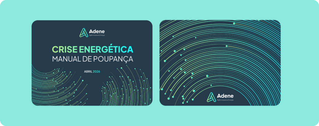
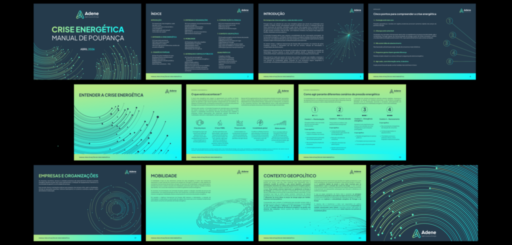
The redesign creates a modern, cohesive identity using green and blue tones to express innovation and sustainability. It ensures a consistent, recognizable brand across all touchpoints.
2
Design system
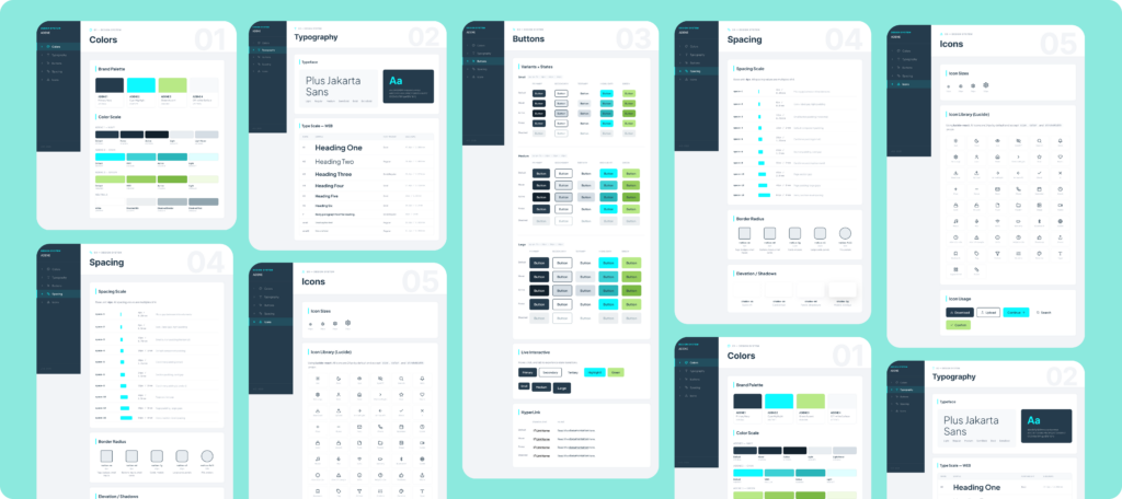
The design system standardizes layouts, components, typography, colors, and iconography across all platforms. It ensures consistency, speeds up production, and keeps the brand cohesive everywhere.
3
Digital Platforms
The digital platforms are improved through usability testing, analysis, and the resolution of identified issues. This ensures a smoother, more intuitive user experience across all interactions.
4
Social Media
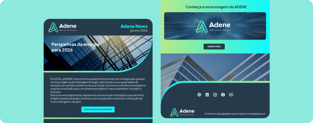
The visual improvements on social media strengthened brand recognition and made content more cohesive and immediately identifiable across all posts. This consistency increased engagement and clarity, helping the brand communicate more effectively and achieve a stronger overall impact.
Design System
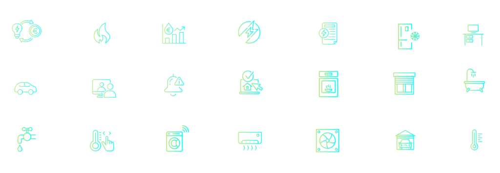
The design system created ensures that all brand touchpoints—websites, mobile platforms, and digital products—follow a unified visual and functional language. It standardizes core elements such as layout structures, spacing, typography, and color usage, so every interface feels consistent and cohesive. It was created according with the accessibility standards (WCAG).
UI components like buttons, forms, and navigation behave the same way across all platforms, while a defined iconography style keeps visuals uniform and recognizable. By using a shared library of reusable assets and clear guidelines, the system eliminates inconsistencies, speeds up production, and guarantees that everything created under the brand looks, feels, and works as one connected experience.
Brand Identity
The brand redesign establishes a clearer, more modern identity by aligning the visual language with the brand’s values of innovation and environmental responsibility. It introduces a cohesive system of updated typography, a refined palette centered on green and blue tones, and a more engaging, high-impact visual form that strengthens recognition and differentiation. By simplifying and unifying the overall look and feel, the redesign improves clarity and communication across all touchpoints, ensuring consistency in both digital and physical applications.